
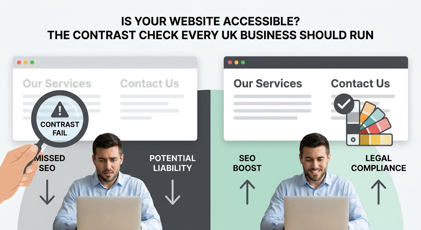
Imagine printing your business leaflet in light grey ink on white paper. Nobody would do it. Yet thousands of UK business websites are doing something almost identical right now, and most owners have no idea.
Colour contrast is one of the most common reasons websites fail accessibility standards. It sounds like a niche design concern, but it has real consequences: lost customers, lower search rankings, and in some cases, legal exposure. The good news is that it is also one of the easiest things to fix once you know what to look for.
What Is Colour Contrast and Why Does It Matter?
Contrast ratio is a measure of how different your text colour is from its background. Web accessibility guidelines (known as WCAG, the Web Content Accessibility Guidelines) set out clear minimum thresholds that websites should meet.
- Normal body text needs a contrast ratio of at least 4.5:1
- Large text (roughly 18pt or 14pt bold) needs a ratio of at least 3:1
- Logos and decorative images have no requirement, but interactive icons and UI elements do
A ratio of 4.5:1 sounds technical, but it simply means the text needs to be noticeably darker or lighter than whatever sits behind it. Classic black text on a white background scores around 21:1. Trendy light grey text on white can score as low as 1.5:1, which is a complete failure.
Despite years of awareness campaigns and design tooling, around 70% of websites still fail basic WCAG contrast checks in 2025. That is not a niche statistic. It means the majority of websites your customers visit every day are harder to read than they should be.
Who Actually Struggles With Low Contrast?
The obvious answer is people with visual impairments or colour blindness, and that group is larger than most business owners realise. Around 1 in 12 men in the UK has some form of colour vision deficiency. Add in those with conditions like cataracts, and you are talking about a meaningful slice of your potential customer base.
But low contrast affects everyone in certain situations. Reading a website outdoors in bright sunlight, on a cheap screen, or on a phone at arm's length all reduce effective contrast. If your site already has a thin margin, those conditions push your text into illegibility.
Older users are also disproportionately affected. If your target market includes anyone over 50, contrast is not optional, it is essential.
The SEO and Business Case You Probably Haven't Heard
Here is the argument that tends to cut through when aesthetics alone don't: poor contrast hurts your search rankings.
Google measures user experience signals like bounce rate, time on page, and engagement. If visitors land on your website and leave immediately because they cannot read it, that behaviour signals a poor experience. Google notices. Your rankings suffer as a result.
Page Experience is now a confirmed Google ranking factor, and accessibility is part of what underpins it. A site that is genuinely readable retains visitors longer, earns more return visits, and converts better. None of that happens if people are squinting at your homepage.
Is There a Legal Risk for UK Businesses?
This is where many small business owners are caught off guard. The Equality Act 2010 requires businesses to make reasonable adjustments so that disabled people can access their services, and digital services are included. Failing to meet basic accessibility standards can, in principle, leave a business open to a complaint or legal challenge.
Public sector websites in the UK are legally required to meet WCAG 2.1 AA standards. Private businesses are not bound by exactly the same regulations, but the Equality Act framework still applies. As accessibility enforcement increases across Europe under the European Accessibility Act (which affects UK businesses selling to EU customers), the legal landscape is tightening.
Nobody is suggesting you will be sued over a slightly pale subheading. But if your website cannot be used by a significant portion of the population, that is a real risk you are carrying unnecessarily.
How to Check Your Website Right Now
You do not need a developer or a specialist audit to do an initial check. These free tools will give you a clear picture in minutes.
- WebAIM Contrast Checker (webaim.org/resources/contrastchecker) lets you enter two colours and see the ratio instantly
- Google Chrome DevTools has a built-in accessibility audit under the Lighthouse tab, which flags contrast failures on your live site
- WAVE by WebAIM is a browser extension that overlays contrast errors directly onto your website as you browse it
- Colour Contrast Analyser by TPGi is a free desktop app for checking any colours on your screen, including images and buttons
Start with your homepage. Check your main body text, any text over images or coloured backgrounds, your navigation links, and your call-to-action buttons. Those are the areas most likely to fail and most likely to cost you customers.
The Most Common Mistakes to Look For
Certain design choices fail contrast checks almost universally. Watch out for these on your own site.
- Light grey text on a white background (very common on modern minimal designs)
- White or pale text over a light-coloured hero image or photo
- Coloured text on a similarly toned background, such as mid-blue text on a light blue panel
- Ghost buttons with thin outlines and near-transparent fill
- Placeholder text in form fields, which is almost always too faint
These choices often come from design trends rather than deliberate decisions. A developer or designer might have used a colour palette that looks beautiful on a high-quality monitor in a dark studio but falls apart everywhere else.
How to Fix It Without Redesigning Everything
In most cases, you do not need a full website overhaul. Small adjustments to hex colour values can bring a failing ratio from 2:1 up to 5:1 without changing the look of a page dramatically.
If you use WordPress or a website builder like Squarespace or Wix, your theme settings will let you update text and background colours directly. A good web designer can make these changes in an afternoon. If you are commissioning a new website, it is worth asking your designer to confirm that the finished site meets WCAG 2.1 AA as a deliverable, not an afterthought.
The goal is not to make your website look clinical or old-fashioned. Accessible design and attractive design are not in conflict. They just require intentional choices about which colours sit next to each other.
A Small Fix With an Outsized Impact
Contrast is not the most glamorous part of running a website. It does not come up in conversations about branding or social media strategy. But it sits quietly underneath everything your website is supposed to do, and if it is wrong, none of the rest performs as well as it could.
Ten minutes with a free tool, a quick look at your homepage, and a conversation with whoever built your site could be all it takes. For a small business competing online, that is a very reasonable return on a very small investment of time.
If you are not sure where your site stands or want someone to take a proper look, get in touch with the Samson Web Design team. We have been building accessible, conversion-focused websites for UK businesses since 2006, and a contrast audit is a straightforward place to start.


