
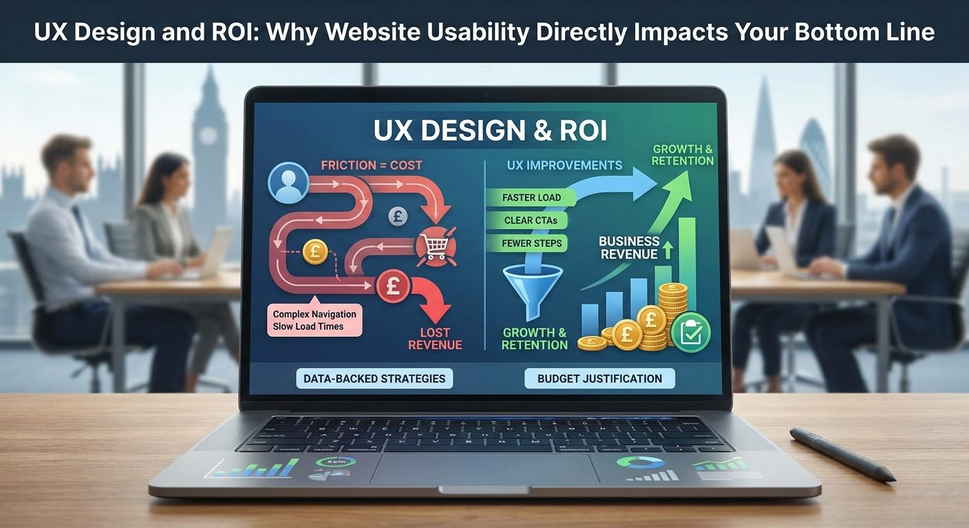
A plumber in Worthing gets thirty visitors a day to his website. His phone number is buried on a contact page, two clicks from the homepage, behind a form that asks for name, address, postcode, and a description of the problem. His competitor has a click-to-call button in the top right corner of every page. Guess who gets the enquiries.
That is friction. And friction is not a design problem. It is a money problem.
Friction Is Not a Design Problem, It Is a Revenue Problem
Friction, in plain language, is anything that slows down, confuses, or discourages a visitor from completing an action on your website. That action might be calling you, filling in a form, buying a product, or simply finding out what you charge. Every extra step, every ambiguous label, every slow-loading page is a small tax on the visitor's patience. Stack enough of those taxes together and the visitor leaves.
Most business owners treat this as an aesthetic issue. They think about whether the site looks modern, whether the colours match the logo, whether the font feels right. Those things matter at the margins. But the real question is whether the site removes obstacles between a visitor and a conversion. If it does not, the site is costing the business money every single day it is live.
The scale of the opportunity is not trivial. Forrester Research found that a well-designed, frictionless user experience can raise conversion rates by up to 400 percent. That is not a tweak. That is a transformation. For a service business converting one percent of visitors into enquiries, removing the right friction could push that to four or five percent without spending an extra penny on advertising.
Go back to the Worthing plumber. He is not losing jobs because his work is poor or his prices are wrong. He is losing jobs because his contact form is three clicks deep. The competitor whose phone number sits on the homepage in large type, next to a one-line form that just asks for a name and a callback number, gets the call. That competitor has, perhaps without even knowing it, applied a basic UX principle: reduce the distance between desire and action.
This article works through the specific friction points that cost UK service businesses and e-commerce sites the most revenue. Each section focuses on one problem, explains the business cost in concrete terms, and gives you something practical to do about it. By the end, you will have a clear picture of where your site is bleeding value and what fixing it is actually worth.
What the Numbers Actually Say About UX Investment
The statistics around UX return on investment can sound too good to be true until you understand what is actually being measured. Forrester Research puts the figure at roughly 100 pounds returned for every pound invested in UX, representing a 9,900 percent return on investment. That is not a projection. It is based on tracking the downstream impact of usability improvements on conversion rates, support costs, and customer retention across real businesses.
The figure holds up when you look at it from a different angle. A McKinsey study tracked 300 companies over five years and found that businesses in the top quartile for design performance achieved 32 percent faster revenue growth than their peers. These were not all tech companies with huge product teams. They were businesses across sectors that had made design, including the design of their customer-facing digital experiences, a strategic priority rather than an afterthought.
Design-centred companies also outperformed the S&P 500 by 228 percent over a ten-year period. That figure comes from the Design Management Institute's Design Value Index, which tracked publicly listed companies. Again, the pattern is consistent: businesses that treat user experience as a core business function, not just a cosmetic layer on top of their product, grow faster and hold their value better over time.
Airbnb is the case study that gets cited most often, and for good reason. The company was in serious financial trouble in its early years. According to co-founder Joe Gebbia, one of the things that turned it around was a deliberate focus on the user experience of the booking process, particularly the quality of the photography and the clarity of the listing pages. Airbnb attributes that UX focus with moving the business from near-failure to a valuation of ten billion dollars. The research note from anatta.io puts the initial rescue valuation at ten million dollars before the growth curve kicked in. Either way, the direction of travel is the same: fixing the experience fixed the business.
The natural reaction from a small UK business owner is that these numbers belong to a different world. Airbnb, McKinsey's 300-company study, the S&P 500 analysis: these are enterprise stories. But the underlying mechanic is identical at any scale. If your website currently converts two percent of visitors into enquiries and a set of targeted UX fixes moves that to three percent, you have grown your lead volume by fifty percent without touching your ad spend or your pricing. The absolute numbers are smaller, but the proportional gain is the same.
For a local service business taking fifteen enquiries a month from the website, a fifty percent improvement means seven or eight extra enquiries. At an average job value of three hundred pounds, that is over two thousand pounds of additional revenue a month from changes that might have cost a few hundred pounds to implement. The maths compounds quickly.
One important caveat: these headline statistics describe what is possible, not what is guaranteed on every site in every sector. A 400 percent conversion uplift requires that the site was significantly broken to begin with and that the right problems were fixed. The way to know what your site is actually doing is to measure it, something the later sections of this article address directly. The numbers above are best understood as a benchmark for what is at stake, not a promise about what will happen. What they do establish, clearly, is that the question is worth asking.
Page Speed: The Silent Killer of UK Website Conversions
Visitors do not consciously think about page speed. They do not sit there watching the progress bar and deciding to leave. They just leave. The decision happens below the level of conscious reasoning, driven by a gap between expectation and experience. Modern internet users expect a page to respond in under two seconds. When it does not, they hit the back button and try the next result. Your competitor.
Google's own data puts hard numbers on this behaviour. As page load time increases from one second to three seconds, the probability of a visitor bouncing increases by 32 percent. That is already significant. But extend the load time to five seconds and the bounce probability rises by 90 percent. At ten seconds, you have lost almost everyone. These are not edge cases. A large proportion of UK business websites, particularly older ones built on shared hosting with unoptimised images, routinely load in four to seven seconds on a mobile connection.
Amazon's internal research illustrated the revenue-per-millisecond principle at enterprise scale: every 100 millisecond delay in page load time cost them one percent of sales. One percent sounds trivial until you apply it to Amazon's revenue figures. At their scale, 100 milliseconds of unnecessary delay costs hundreds of millions of pounds a year. The principle scales down just as precisely. A small e-commerce site turning over fifty thousand pounds a year loses five hundred pounds annually for every 100 millisecond drag on its load time. Add a second of unnecessary loading and you are looking at five thousand pounds.
For a UK service business taking twenty enquiries a month from the website, the maths is more conservative but still meaningful. If faster pages reduce the bounce rate by ten percent, that is two extra enquiries per month reaching the contact form. At a conversion rate of fifty percent from enquiry to job, and an average job value of two hundred and fifty pounds, that is three thousand pounds of additional annual revenue from a speed improvement that might have taken an afternoon to implement.
What Actually Slows Sites Down
The most common culprit on small business websites is uncompressed images. A single hero image uploaded straight from a camera or iPhone can be four to eight megabytes. It should be under two hundred kilobytes for web use. Tools like Squoosh (free, browser-based, no account needed) and ShortPixel (a WordPress plugin that automates compression on upload) solve this problem permanently rather than requiring manual attention each time.
Beyond images, browser caching is a low-effort fix with a measurable impact. Caching tells the visitor's browser to store certain files locally after the first visit, so repeat visitors load the site significantly faster. On WordPress, a plugin like WP Super Cache or W3 Total Cache handles this without requiring technical knowledge. Your web host or developer can also enable caching at the server level.
Server location matters more than most small business owners realise. If your website is hosted on a server in the United States or a non-specific European data centre, every request from a UK visitor travels further and returns more slowly. Choosing a UK-based hosting server reduces latency for British visitors by keeping the data geographically close. Several UK hosting providers offer servers based in London or the Home Counties specifically for this reason.
How to Check Your Speed Right Now
Two free tools give you an immediate diagnosis. Google PageSpeed Insights (pagespeed.web.dev) scores your site on both mobile and desktop, flags the specific issues causing delays, and explains each one in plain language. GTmetrix provides a more detailed waterfall view, showing exactly which files are loading slowly and in what order.
Run both on your homepage and your most important landing page. Look particularly at the mobile score, since that is where most visitors arrive and where performance is hardest to achieve. A score below 50 on mobile PageSpeed Insights is a strong signal that speed is actively costing you conversions.
There is a second reason to take speed seriously beyond the direct conversion impact. Google made Core Web Vitals an official ranking factor in 2021, meaning that a slow site does not just lose visitors once they arrive, it appears lower in search results to begin with. Fixing page speed therefore delivers a double benefit: more visitors finding the site through organic search and more of those visitors staying long enough to convert. Those two effects compound each other, which is why page speed consistently delivers some of the highest ROI of any UX improvement a small business can make.
Mobile Usability Is Not Optional When Half Your Traffic Is on a Phone
Over 60 percent of UK web traffic now arrives on a mobile device. That figure has been climbing steadily for years, and for many local service businesses, the actual share is even higher because people search on their phones while they are out and about, looking for a plumber, a cleaner, or a nearby cafe. If your website was built primarily for a desktop screen and nobody has revisited the mobile experience since, you are already losing a measurable slice of your potential customers before they have read a single word about you.
Google made this concrete with mobile-first indexing. The mobile version of your website is what Google primarily evaluates when deciding where to rank you in search results. A site that looks fine on a laptop but breaks on a phone is not just frustrating for visitors; it is actively working against your search rankings. You can have excellent content and strong backlinks, and still find yourself outranked by a competitor with a simpler, cleaner mobile experience.

The most common mobile friction points are easy to spot once you know what to look for. Tap targets that are too small force users to zoom in and miss-click repeatedly. Text that requires pinch-to-zoom to read is an immediate signal that the site was not designed with a phone in mind. Missing click-to-call buttons are a particularly costly omission for trade businesses: a user who cannot tap a phone number to dial it will simply close your site and try the next result. Forms with six or eight fields are painful to complete on a desktop; on a small screen, they become a reason to give up entirely.
Consider a tradesperson: a gas engineer, a roofer, a kitchen fitter. Someone searching for their services at 7pm on a phone has strong buying intent. If that person lands on a site that renders as a tiny, unreadable desktop layout requiring horizontal scrolling, they will leave within seconds and call a competitor whose site loads cleanly and has a visible phone number at the top. That lost call is a lost job, potentially worth hundreds or thousands of pounds. The friction is not abstract; it has a direct cash cost.
Responsive Design vs a Separate Mobile Site
There are two technical approaches to mobile compatibility: responsive design and maintaining a separate mobile site (typically at an m. subdomain). For small businesses, responsive design is the practical and cost-effective choice by a significant margin. A responsive site uses flexible layouts and CSS media queries so the same codebase adapts to any screen size, from a large desktop monitor to a small smartphone.
A separate mobile site means maintaining two versions of every page, managing duplicate content issues, and paying for double the development time whenever you update anything. Responsive design eliminates all of that overhead. A good web designer builds it once and it works everywhere. It is also what Google recommends explicitly in its own documentation.
To find out right now whether your site has mobile issues, run it through Google's free Mobile-Friendly Test. It flags specific problems including text that is too small to read, clickable elements that are too close together, and content that is wider than the screen. It takes about thirty seconds and gives you a concrete list to act on, or to hand to your web designer as a brief.
Call-to-Action Clarity: Where Vague Wording Bleeds Revenue
A call-to-action is the specific prompt that tells a visitor what to do next. It is the button, the link, or the line of text that says: here is your next step. Done well, it removes any need for a visitor to think. Done badly, it creates a moment of hesitation that tips into a decision to leave. Examples of strong CTAs include 'Get a Free Quote', 'Book a Survey', and 'Call Us Now'. Each of those tells the visitor exactly what they will get and what they need to do to get it.
The research on this is striking. Personalised or benefit-led CTAs convert 202 percent better than generic alternatives like 'Submit' or 'Click Here'. That is not a marginal improvement; it is more than doubling your conversion rate from a change that costs nothing beyond a few minutes of copywriting. Generic button text is still the default on a huge number of small business websites, which means this is one of the lowest-effort, highest-return fixes available.
The friction created by vague CTAs is cognitive. When a visitor cannot immediately see what happens if they click a button, their brain has to do extra work to figure it out. That work takes a fraction of a second, but that fraction is enough to introduce doubt. Doubt in a buying context tends to resolve in favour of inaction. The visitor does not make a deliberate decision to leave; they just drift away because nothing pulled them forward clearly enough.
A Real-World Example: The Cleaning Company Rebrand
Take a residential cleaning company with a homepage button that reads 'Contact Us'. That button is technically accurate; pressing it does allow you to contact them. But it tells the visitor nothing about what to expect. Is there a form? A phone number? A long wait for a reply? The ambiguity adds friction.
Change that button to 'Get Your Free Home Clean Quote' and several things happen at once. The visitor knows the outcome is a quote. They know it is free, removing a common hesitation about hidden costs. They know it is specific to home cleaning, confirming they are in the right place. Every one of those clarifications removes a micro-friction point. A cleaning company making that single change to their primary CTA should logically expect a meaningful lift in enquiries from the same level of traffic, because more of the people who were already interested enough to reach the homepage will now take that next step.
Placement, Contrast, and Repetition
Where a CTA appears matters as much as what it says. Your primary CTA should be visible above the fold on the homepage, meaning a visitor sees it without scrolling. If someone lands on your site and has to hunt for a way to contact you, you have already introduced unnecessary work. Repeat the CTA after each service description so that as a visitor reads about what you offer and feels a moment of interest, the next step is immediately in front of them.
On mobile, a sticky header with your phone number or a 'Get a Quote' button that remains visible as the user scrolls removes the need to scroll back up to take action. That small convenience has a real effect on conversion rates, particularly for trade and service businesses where the primary conversion is a phone call or an enquiry form submission.
Colour contrast and button size are not decoration. A CTA button that blends into the background because a designer matched it to the page colour scheme is functionally invisible to a distracted user scanning quickly. There are specific accessibility contrast ratios defined in the WCAG guidelines, but from a pure usability standpoint, the rule is simpler: your CTA button should be the most visually prominent interactive element on the page at any given time.
To test CTA variations without guesswork, tools like Microsoft Clarity (free) allow you to watch session recordings and see where users click, hesitate, or drop off. For formal A/B testing, where you show variant A to half your visitors and variant B to the other half and compare outcomes, platforms built on or succeeding Google Optimize allow you to run structured experiments on button text, colour, and placement without touching your core site code.
Navigation Structure: How a Confusing Menu Costs You Leads
Navigation is where a lot of small business websites quietly bleed enquiries without anyone realising it. A visitor who cannot find the page they are looking for does not usually submit a complaint or ask for help; they just leave. The loss is invisible unless you are actively looking for it in your analytics data.
The three-click rule is a useful working heuristic: if a visitor cannot reach what they need within three clicks from the homepage, dropout rates increase sharply. It is not a hard law, but it captures something real about patience and effort online. People are not browsing your site for entertainment; they have a specific intent and a limited tolerance for obstacles between them and the answer they need.
Common navigation mistakes on small business websites follow predictable patterns. Too many top-level menu items is one of the most frequent: once a menu exceeds around seven items, it becomes cognitively overwhelming and visitors start to skip rather than read. A menu with twelve items does not feel comprehensive; it feels like work. The other common mistake is burying important service pages under vague headings. A menu item that reads 'What We Do' or 'Our Services' forces the visitor to click through to discover what those services actually are. If your most important service is not named in the top-level navigation, a meaningful proportion of visitors will never find it.

Using Behaviour Tools to Find Navigation Problems
The hidden cost of poor navigation is that it does not show up obviously in standard analytics. You can see that visitors are leaving, but not necessarily why or where they got stuck. Behaviour tools close that gap. Heatmaps via Hotjar or Microsoft Clarity show you exactly where users click, which menu items they hover over and then abandon, and how far down a page they scroll before giving up. Session recordings let you watch real user journeys and spot the exact moments of confusion. These tools turn a vague sense that 'the site could work better' into specific, actionable evidence.
The principle underlying good navigation is organising it around what the customer is trying to achieve, not around how the business is internally structured. A company might organise itself into departments: sales, operations, aftercare. That structure makes sense internally. It makes almost no sense to a visitor who is simply trying to find out whether you cover their area, what it costs, and how to get in touch. Navigation designed around those questions converts; navigation designed around internal org charts does not.
A Worked Example: Emergency Roofing Repairs
Consider two roofing companies with identical services and identical pricing. The first has a menu structure that reads: Home, About Us, Services, Gallery, Contact. Emergency repairs sit under Services as a third-level sub-item. A homeowner with a roof leak found on a Saturday afternoon has to click Services, find the dropdown, scan for emergency options, and click again before they even see a phone number.
The second roofing company lists 'Emergency Repairs' as the first item in their main navigation, visible immediately on every page. That visitor finds what they need in one click and calls. The first company loses that enquiry not because their work is worse or their price is higher, but because their navigation was built around how the business thinks about its own services rather than around the urgency of the customer's situation. Over a year, across dozens of similar visitors, that structural difference represents a material revenue gap.
Breadcrumbs and Page Titles
Breadcrumbs are the small navigational trail shown near the top of a page, typically reading something like: Home > Services > Roof Repairs > Emergency Roof Repairs. They reduce friction by letting a visitor see exactly where they are within the site structure and backtrack one level without hitting the browser's back button repeatedly. They also serve a direct SEO function: search engines read breadcrumb structure as a signal of how a site is organised, which supports better indexing of deeper pages. Adding breadcrumbs to a site with more than a handful of pages is a low-effort change with both usability and ranking benefits, and most modern CMS platforms including WordPress implement them with a single plugin or theme setting.
Checkout and Enquiry Form Friction: The 35 Percent You Are Leaving on the Table
Most businesses treat high cart abandonment as a marketing problem. They spend money on retargeting ads, abandoned cart emails, and discount codes. But the real problem is usually structural: the checkout or enquiry process has too much friction baked into it, and no amount of follow-up fixes that in the moment it matters most.
The cart abandonment research from the Baymard Institute, built on over 200,000 hours of UX research, shows that optimising checkout design alone can lift e-commerce conversion rates by 35.26 percent. The global average cart abandonment rate sits at approximately 70 percent. That means roughly seven out of every ten people who add something to a basket leave without buying. Some of those people were never going to convert regardless of what you did. But a significant portion of them are abandoning because your checkout got in their way.
The Baymard data also shows that 24 percent of shoppers have abandoned a checkout specifically because the site required them to create an account before purchasing. That single friction point, forcing registration before the transaction is complete, is costing UK e-commerce businesses a measurable slice of their revenue every single day. The fix is straightforward: enable guest checkout. Let people buy first and offer account creation afterwards, at the confirmation stage, when the hard part is done.
Other common friction points in checkout flows include:
- Hidden shipping costs that only appear at the final payment step
- Too many screens between basket and confirmation
- A lack of familiar payment options (PayPal, Apple Pay, or Klarna alongside card payments)
- No visible trust signals at the payment stage, such as SSL padlock, payment logos, or review scores
Practical fixes are available for all of these. Show shipping costs as early as possible, ideally on the product page or at least in the basket. Use an address lookup API such as Loqate to replace manual address entry with a postcode search that auto-fills the fields. This alone cuts a significant amount of typing on mobile and reduces input errors. Add progress indicators to multi-step checkouts so users can see they are on step two of three rather than wondering how many pages are left. That visibility reduces abandonment because it removes uncertainty.
For service businesses, the enquiry form is the functional equivalent of a checkout. Someone landing on your contact page and filling in a form is performing the same psychological act as adding something to a basket: they are committing. And the same rules apply. The minimum viable enquiry form for a service business is three fields: name, phone number or email address, and a brief message field. Every field you add beyond that reduces completion rates. Asking for company name, budget range, job title, and how they heard about you before you have even spoken to them is the equivalent of asking a customer to create an account before they can buy a tin of paint.
If your form has more than five fields, audit each one honestly. Ask whether you actually need that information before the first conversation, or whether you are collecting it out of habit. The answer is almost always that you can get it later.
Trust Signals: UX Elements That Do the Selling Before You Say a Word
Trust is not purely a marketing concern. It is a usability problem. If a visitor arrives on your site and does not feel confident about who you are within the first few seconds, no headline, no offer, and no well-crafted copy will compensate. The decision to stay or leave happens faster than conscious thought.
Nielsen Norman Group research puts that first impression window at approximately 50 milliseconds. Your visitor is not reading your value proposition in that window. They are processing visual credibility cues: does this look professional, does it feel legitimate, does it match what I expected when I clicked the link. UX decisions drive all three of those perceptions before a single word is read.
The trust signals that have measurable impact on conversion include:
- Customer reviews and star ratings displayed close to decision points
- Case studies or testimonials that name real businesses or include verified outcomes
- Professional photography of actual staff, premises, or completed work rather than generic stock images
- A visible phone number and physical address in the header or footer
For UK businesses specifically, the visible details matter more than many owners realise. Displaying a standard UK geographic phone number (not a 0845 or 0870 premium rate number), a real postal address, and any relevant trade association or Companies House registration adds layers of perceived legitimacy that anonymous-looking websites simply do not have. A plumber with Gas Safe registration displayed, a solicitor with SRA membership visible, or an accountant showing their ICAEW membership is giving visitors an external verification that they are who they say they are.
SSL certificates are now a baseline expectation, not a differentiator. Chrome flags any site without HTTPS as 'Not Secure', and that warning in the browser bar kills conversions because it triggers an active alarm in the user's mind. If your site is still running on HTTP, that is not a technical oversight, it is a revenue problem. Any reputable UK hosting provider will include a free Let's Encrypt SSL certificate as standard.
Where you place trust signals matters as much as whether you have them. A dedicated testimonials page does less work than a review displayed next to a pricing table or a star rating sitting directly above an enquiry button. Put social proof at the moment of decision, not in a silo where only people who go looking for it will find it.
Recency matters too. A business showing 50 Google reviews is impressive. A business whose most recent review is from 2022 looks dormant, even if the company is thriving. Actively encourage recent customers to leave reviews, and if you display testimonials on your own site, include the date or at minimum the year. An undated five-star quote raises the question of when it was written and whether the business has changed since.
Readability and Content Hierarchy: When Text Gets in the Way
The assumption that more information builds more trust leads a lot of business owners to fill their website pages with dense paragraphs of text. It does the opposite. A wall of text is a friction point. It signals effort to the visitor before they have decided they want to make that effort, and most of them will not.
Eye-tracking studies going back to early Nielsen Norman Group research have consistently shown an F-shaped reading pattern on web pages. Users read the first line or two in full, then scan down the left edge, catching the first few words of each subsequent paragraph. They are not reading your third sentence. They are not reaching your fifth paragraph unless the first four have already earned their attention.
The practical implication is straightforward. Put your most important information in the first sentence of every paragraph. Use subheadings so that a visitor scanning vertically can identify which section is relevant to them without reading every word. Keep paragraphs to two or three sentences at most. If you find yourself writing a four-sentence paragraph, it almost certainly contains two separate points that deserve to be split.
Font size is a usability factor that often gets overridden in favour of aesthetics. Body text below 16px creates reading friction, particularly on mobile screens and for older users. A significant portion of UK web traffic comes from people over 50, and small text is a genuine barrier for that audience. Set your base font size at 16px as a minimum, and consider 17px or 18px for paragraph text if your design allows it.
Line length affects how comfortably people read. Between 50 and 75 characters per line is the readable sweet spot for body text. Very wide columns force the eye to travel too far across the page, losing its place on the return. Very narrow columns create too many line breaks and disrupt reading rhythm. On a full-width desktop layout, this usually means constraining your text container rather than letting it stretch edge to edge.
Plain language reduces friction for service businesses in a way that no amount of design polish can replace. Visitors are not specialists in your trade. A roofer who writes 'We fix roofs fast, at a fair price, anywhere in West Sussex' will convert better than one who offers 'comprehensive roofing envelope solutions with a commitment to substrate integrity.' The second version sounds like it was written for an industry award entry. The first one sounds like a person talking.
Contrast ratios are both a legal consideration and a conversion factor. The WCAG AA accessibility standard requires a minimum contrast ratio of 4.5:1 for normal-sized text against its background. Under the UK Equality Act 2010, websites that fail to meet reasonable accessibility standards can face legal challenge. But beyond compliance, low-contrast text (grey text on a white background is the most common offender) simply makes pages harder to read and increases the likelihood that a visitor gives up. Tools like the WebAIM Contrast Checker let you test any colour combination in under a minute.


