
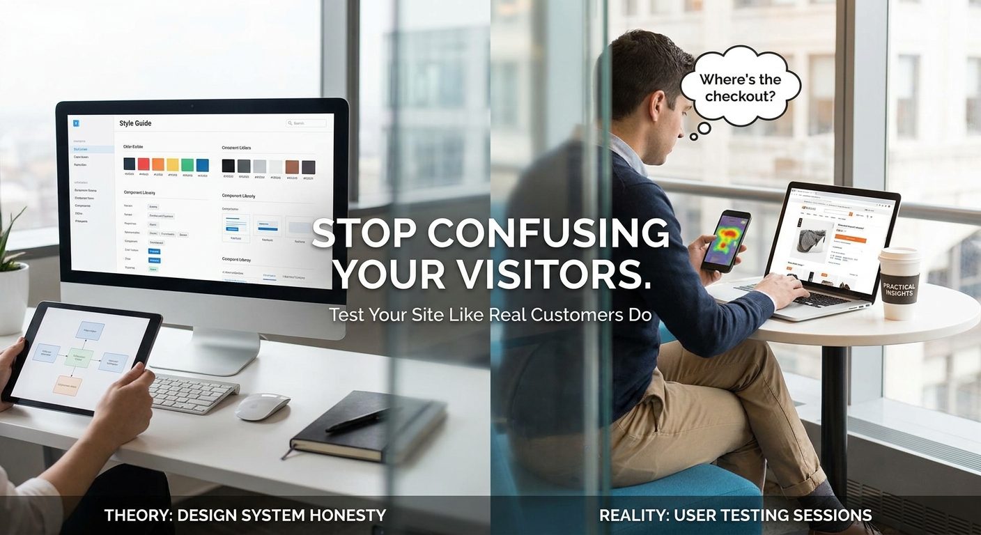
Most business owners spend weeks agonising over fonts, colours, and button shapes, then launch their site and watch visitors leave within seconds. The site feels perfectly logical to you because you built it. Every page, every menu label, every shortcut makes complete sense in your head. The problem is your customers are not inside your head.
UK businesses lose an estimated £4.6 billion per year to poor website usability, according to Econsultancy research. That is not a London-only statistic. That figure covers every SME whose contact form is buried three clicks deep, every trades business whose quote request button disappears on a mobile screen, every shop where the checkout process quietly falls apart on an older Android phone.
Why Your Website Feels Fine to You But Baffles Everyone Else
There is a well-documented cognitive trap called the curse of knowledge. Once you know something, you genuinely cannot remember what it felt like not to know it. You built your site, so you know that your phone number is in the footer, that your services are under the dropdown labelled "What We Do", and that the pricing page is reachable from the banner at the top. You navigate the whole thing in about four seconds without thinking.
A customer arriving for the first time has none of that. They do not know your menu structure, they do not know what you call your services, and they are almost certainly on a smartphone with one hand while doing something else. They have roughly eight seconds of patience before they hit the back button and try your competitor instead.
Google Analytics will show you that people are leaving. It will show you a bounce rate, an average session duration, and which page they exited from. What it will never show you is the moment they scrolled past your phone number three times without seeing it because you styled it in grey text on a white background. It cannot show you the pause, the squint, the second attempt that still went wrong.
A single five-minute observation of a real customer trying to find your contact number will teach you more than a month of staring at bounce-rate data. Not because the data is wrong, but because the data describes the symptom and the observation reveals the cause. You watch someone try to tap a button that is too small for a finger, and suddenly the 68% mobile exit rate on that page stops being a mystery.
This is exactly the kind of insight that most small businesses assume costs a fortune to obtain. It does not. The methods covered in this article are either free or close to it. You do not need a usability agency, a specialist software subscription, or a formal research budget. You need a task list, a willing stranger, and the discipline to keep quiet while they struggle. Every technique here is something a business owner in Worthing, Leeds, or anywhere else in the UK can run themselves this week, with no prior experience in research or design.
What User Testing Actually Is (and What It Is Not)
User testing is watching real people try to complete real tasks on your website. That is it. It is not asking someone whether they like your colour scheme. It is not sending a survey asking customers to rate their experience out of ten. It is not reading your Google reviews and drawing conclusions from the ones that mention the website.
Those things have their uses, but they measure opinions. User testing measures behaviour. Behaviour is far more reliable, because people do not always know why they struggled, and they often cannot articulate what confused them. When someone says "the site was fine" in a review but spent four minutes failing to find your opening hours, the review and the behaviour are telling completely different stories. The behaviour is the truth.
There are two broad formats worth knowing about. Moderated testing means you are present, either in the same room or on a video call, while the participant works through the site. You can prompt them, ask follow-up questions, and watch their face. Unmoderated testing means the participant records themselves completing tasks independently, usually through a tool that captures their screen and voice. Both approaches are valid; the choice depends on your budget, your schedule, and how much context you need from the session.
For most small business owners running their first tests, moderated sessions are the better starting point. You catch things a recording might miss, like a moment of hesitation that resolves itself before the participant says anything out loud. You can also ask a gentle clarifying question at exactly the right moment: "What were you expecting to happen there?" That single question, asked at the point of confusion, often unlocks more insight than any automated tool.
What you are collecting in either format is behavioural evidence. Wrong clicks. Pauses at unexpected points. Expressions of confusion. Moments where a participant re-reads something twice because it did not make sense the first time. You are not scoring opinions. You are documenting what actually happens when a stranger meets your site without you there to guide them.
One finding that surprises most business owners: you do not need a large sample. Research from Nielsen Norman Group consistently shows that three to five participants in a usability session will expose the majority of a site's critical problems. Beyond five, you start seeing the same issues repeat rather than new ones emerge. This means a morning, two willing participants, and a clear task list can genuinely change how you understand your site. The barrier is lower than most people think.
The Trap of Asking Friends and Family to Test Your Site
It is the most natural thing in the world. You have built something, you are nervous about it, and the easiest people to ask are the ones already around you. Your partner, your mate who works in IT, your sister who runs her own business. They are available, they are willing, and they will almost certainly tell you it looks great.
That is exactly the problem. People who know you want to be kind. When they hit a confusing moment, they push through it rather than admitting they are stuck, because admitting confusion feels like a criticism of you personally. They will find the thing eventually, smile, and say it was fine. The confusion happened, the hesitation was real, but you never saw it because they smoothed it over before you could notice.
This mirrors a well-documented problem in prototype testing more broadly. When participants sense that a tester has a stake in the outcome, they start second-guessing what they are supposed to say. They filter their real reactions and perform a version of success instead. A friend testing your site is doing the same thing, not out of dishonesty, but out of social instinct. The data you collect is contaminated before the session even starts.
There is a second issue that is just as damaging. Friends and family already know roughly what your business does. Your partner knows you are a plumber who covers emergency callouts in the Worthing area. Your mate knows you sell handmade leather goods. That background knowledge fills in gaps that a real customer would simply fall into. When your navigation is ambiguous, someone who already knows the answer will guess correctly and move on. A genuine stranger would have stopped, backtracked, or left.
The fix is recruiting strangers who actually match your customer profile. This sounds harder than it is. Two people in a local coffee shop, if they fit your audience, will give you more useful data than ten friends. A post in a local Facebook group asking for ten minutes of someone's time in exchange for a coffee voucher will typically get responses within an hour. People are more willing to help than most business owners expect.
Before you recruit anyone, define who your actual customer is. Build a simple persona: the age range, the level of comfort with technology, the device they are most likely to be using, and the reason they might come to your site. Be specific rather than vague. A general "adult" is not a useful target. A homeowner aged 35 to 65 who uses a smartphone to search for local services is a testable, findable person.
To make this concrete: if you run a plumbing business in Worthing, the right tester is a homeowner in that age bracket who reaches for their phone first when something goes wrong at home. They are not a twenty-year-old developer who navigates websites for a living and unconsciously compensates for every friction point without noticing. A developer will find your contact form. Your actual customer at 11pm with a leaking pipe, tired and stressed, on a small screen with autocorrect fighting them, might not. Test with the second person, not the first.
How to Write a Test Script That Gets Honest Reactions
A test script is not a list of questions. It is a short collection of realistic tasks that mirror what a genuine customer would actually try to do on your site. The distinction matters because questions like "can you find the About page?" point the participant directly at the answer, which defeats the entire purpose of watching them navigate.
Good tasks give the participant a real goal and let them figure out their own path. Something like "You need a quote for a new bathroom, use this site to find out how to get one" works because it describes a situation, not an instruction. The participant has to interpret your site exactly as a real visitor would, deciding for themselves where to click and what to read.
Bad tasks sound like this: "Please click on Services." That is not a task, it is a stage direction. You have told them exactly where to go, so you learn nothing about whether they would have found it on their own.
Keep the whole script to four or five tasks. A session covering that many tasks should run comfortably under thirty minutes, and that matters because participant focus drops off sharply after that point. Long sessions produce diminishing returns: the later tasks get rushed, people start guessing rather than genuinely engaging, and the data becomes messy.
Start with a warm-up task that has nothing to do with your main goals. Ask them to find opening hours, or look up a phone number, something low-stakes that gets them used to thinking out loud before you start watching the things you actually care about. People who skip straight into the critical tasks tend to perform rather than explore.
Deliberately include one task you are confident will go smoothly and one you privately suspect is broken. The contrast is revealing. When a participant breezes through the first and stumbles on the second, you can be fairly sure the problem is specific to that area rather than a general confusion about the site. If they struggle with both, you may have a broader structural problem worth addressing first.
Before any of this, tell participants clearly and specifically that you are testing the website, not testing them. Say it out loud, not as a throwaway line. When people understand this, their whole posture shifts from trying to give the "right" answers to genuinely exploring and reporting what they find confusing. That mindset shift is what produces honest data.

Running a Session on Zero Budget With Tools You Already Have
In-person moderated testing costs nothing except time. You need a laptop, one willing participant, and a notepad. Sit at a slight angle rather than directly beside them, close enough to see the screen but not so close that they feel watched. Your job is to stay quiet and take notes, not to help.
Ask participants to think out loud as they work. Tell them to say whatever comes into their head, including doubts, wrong turns, and frustration. This is called the think-aloud protocol, and it is one of the most useful things you can do in a session because it turns invisible hesitation into audible, specific feedback. Without it, you see a pause but you do not know whether the participant is confused, distracted, or simply reading carefully.
For remote sessions, Zoom and Google Meet both support screen sharing and recording at no cost. The participant shares their screen, you watch and take notes, and the recording gives you something to review later when you are not trying to observe and write simultaneously. Always ask for explicit permission before you start recording, a simple verbal confirmation at the start of the call is fine, but do not skip it.
Free tools worth knowing
If you want to test at a slightly larger scale without spending anything, two tools stand out. Hotjar's free tier provides heatmaps and session recordings for up to 35 sessions per day, which is more than enough for a small business site. It shows where people click, how far they scroll, and where they drop off.
Microsoft Clarity is completely free with no session limit. It records real visitor sessions, shows click maps and scroll depth, and flags what it calls rage clicks, those moments where a user frantically clicks something that is not actually a link. Rage-click detection is particularly useful because it pinpoints broken expectations precisely: the user expected something to be interactive, it was not, and that failure registers in the data automatically. You do not have to guess or observe it in a live session.
Loom is worth adding to the list for genuinely unmoderated testing. The free plan supports up to 25 videos. You send a participant a link to a Loom recording request, give them a written task, and ask them to record their screen as they work through it. They do it in their own time, you watch it back later. This asynchronous approach works well if finding a mutually convenient time for a live session proves difficult, which it often does when you are a sole trader or running a small team.
A realistic target for a solo business owner running their first round of testing is five participants across two evenings. Research consistently shows that five participants uncover the large majority of the most pressing usability problems on a site. You do not need twenty people and a dedicated testing suite. You need five honest strangers and a quiet room.
The Seven Warning Signs to Watch for During a Session
Most of what user testing reveals does not come from what participants say. It comes from what they do, and specifically from the small involuntary behaviours that happen when something on the page does not quite make sense. Learning to spot these in real time is what separates a useful session from one that just produces vague notes about the site feeling "a bit confusing."
1. The hover pause
The participant's mouse or thumb moves towards an element, stops, and then drifts away without clicking. This almost always signals that the label or button copy is unclear. They were attracted to it, considered it, and decided it probably was not what they needed. The fix is usually to rewrite the label so it describes the outcome rather than the category. "Get a quote" works better than "Contact" for a trades business because it tells the visitor what they will get, not just where they are going.
2. The back-button bounce
The participant clicks through to a page and immediately returns to where they came from. The page they landed on did not match their expectation. This can happen because a link is ambiguously labelled, or because the page itself opens with content that looks wrong for the task they are trying to complete. Watch for this particularly on service pages that open with a long block of text rather than any clear signal of what the page covers.
3. Scroll blindness
The participant scrolls straight past your main call-to-action without registering it at all. This is more common than most site owners expect, and it usually happens because the CTA has been styled to look like a banner or promotional block. Years of exposure to online advertising has trained people to visually filter anything that resembles an ad. If your button sits inside a coloured banner with a decorative background, it may be invisible in practice even though it is prominent in your mind.
4. Wrong-menu entry
The participant clicks into a section you did not expect them to use for that task. For example, they look for pricing information under "About" rather than "Services." This is not the participant being wrong, it is your information architecture not matching their mental model of how this type of business organises its information. Navigation improvements validated with testing consistently show that the labels site owners choose reflect internal logic rather than the way customers actually think about the service.
5. The spoken apology
The participant says something like "sorry, I'm not very good with computers" or "this is probably just me." Stop and register this whenever it happens, because it is one of the most telling moments in a session. The participant is not bad at computers. Your design has made them feel stupid. When this happens, the problem is almost never the participant's technical ability, it is that the site has failed to communicate clearly enough for a non-specialist to feel confident. The fix might be simpler language, more obvious affordances, or better feedback when an action is completed.
6. Silent abandonment
The participant stops typing or clicking and simply sits there. In a moderated session this is your cue to gently ask what they are thinking, but the pause itself is the signal. In a real browsing session, this is the moment a visitor closes the tab. It tends to happen at decision points: a form with too many fields, a page that ends without a clear next step, or a checkout process that asks for information the visitor was not expecting to provide.
7. Repeated return to the homepage
The participant uses the logo as a reset button more than twice during a single task. They are lost and treating the homepage as a safe base to restart from. Once might be navigational preference. Twice in the same task is a strong signal that the site's internal structure is not giving them enough context about where they are or how to move forward. The fix here is usually a combination of clearer breadcrumbs, better page headings, and ensuring that every internal page has a visible and logical next step rather than leaving the visitor to retrace their path.
Each of these behaviours maps directly to a specific category of fix. The hover pause and wrong-menu entry point to labelling and information architecture. The back-button bounce and silent abandonment point to page structure and content hierarchy. Scroll blindness points to visual design and CTA styling. The spoken apology points to language and feedback. Repeated homepage returns point to overall navigation. Keeping this mapping in mind while you take notes means you leave the session with a list of problems that already have a general direction of solution attached to them.
Turning Session Notes Into a Prioritised Fix List
The hour immediately after a testing session is the most valuable hour you have. Memory degrades fast, and the details that felt vivid during the session, the exact moment a participant frowned at a form field, the quiet sigh before they gave up on the checkout, will blur into a vague impression of "it seemed okay" by the next morning. Write up your observations the same day, ideally within two hours of finishing.
The simplest format that works in practice is a three-column table. The columns are: what happened, where it happened (the specific page and element), and how many participants hit the same problem. You do not need specialist software. A shared Google Sheet works perfectly well, and it makes it easy to share with a developer later.
Once you have your raw observations logged, score each issue on two dimensions: frequency and severity. A problem that three out of five participants encountered and that stopped them completing the task scores far higher than a cosmetic annoyance one person mentioned once. These are not equally weighted. A broken checkout flow that confused four participants is more urgent than a slightly awkward font choice that one person noticed.
For severity, the scale Jakob Nielsen developed rates issues from 0 to 4. A 0 means it is not actually a problem. A 4 is a usability catastrophe: the user is entirely blocked and cannot proceed without help. usability severity ratings like this give you a shared language when talking to a developer, rather than vague descriptions like "people seemed confused here." Fix every 3 and every 4 before you launch or relaunch. There is no good argument for going live with a known blocker.
Once everything is scored, divide the list into two groups: quick wins and structural changes. Quick wins include things like relabelling a button, rewriting a confusing heading, or making a phone number clickable on mobile. These can go live within a day and they should, because small visible improvements build momentum and often have an outsized effect on conversion.
Structural changes are a different matter. Rebuilding a navigation menu, reorganising the layout of a service page, or rethinking a multi-step form all require proper development time. These need to be scheduled into a sprint rather than patched in at midnight before you tell yourself the site is fixed.
When you share the fix list with your web designer or developer, do not just send the written notes. Include timestamps from the session recording so they can jump straight to the exact moment of confusion. Reading "participant struggled with the contact form" is much less useful than watching a 40-second clip of someone hunting for the submit button. The recording removes ambiguity and almost always shortens the conversation about what actually needs changing.

Card Sorting: The Fifteen-Minute Exercise That Fixes Broken Navigation
Card sorting is one of the most direct ways to find out whether your site's navigation makes sense to anyone other than you. Instead of asking participants to find their way around a structure you designed, you ask them to build the structure themselves. The logic is simple: if your categories reflect how customers actually think, they should be able to reconstruct something close to your existing menu. If they cannot, you have a mismatch worth fixing.
An open card sort gives each participant a set of index cards, physical cards on a table or digital equivalents in a tool, with one page or topic written on each. They arrange the cards into groups that feel natural to them, then give each group a name. You do not provide the category names; that is the whole point. You want to see how they would label things unprompted.
Two free tools make this easy to run remotely. Maze includes a card sorting feature on its free plan. OptimalSort from Optimal Workshop has a free tier that supports up to ten participants, which is enough for a meaningful first round of testing. Both tools automatically generate output showing which cards participants grouped together most often, saving you the work of manually tallying results.
The findings can be illuminating in very practical ways. A plumbing business, for example, might have its services split across three separate menu items: one for emergency callouts, one for boiler work, and one for leak detection. To the business owner, these are distinct service categories. To the customer standing in a wet kitchen at 9pm, they are all the same thing: "get someone here now." A card sort with eight local residents would surface that grouping within an afternoon, giving the business a clear reason to consolidate those pages under a single urgent-response section.
A closed card sort works the other way around. You provide the category names and ask participants to place each card where they think it belongs. This is useful once you have redesigned a navigation structure and want to check whether your new labels are actually clearer before committing to the rebuild. Think of open sorts as discovery and closed sorts as validation.
Eight participants is enough to run a card sort that reveals genuine patterns. Research consistently shows that the majority of navigation mismatches surface within the first handful of participants. user testing research confirms that even small sample sizes identify the most significant structural problems, which means you do not need a large budget or a long timeline to get useful data from this exercise.
The output feeds directly into your navigation labels and your page hierarchy. If participants consistently grouped certain topics together, those topics should probably live in the same section. If they named a group something completely different from your current menu label, that is the label to use instead. Card sorting translates directly into IA decisions, making it one of the highest-return activities in the whole testing toolkit.
Five-Second Testing: Does Your Homepage Pass the Glance Test
Five-second testing is exactly what it sounds like. A participant sees your homepage for five seconds, then the image disappears and you ask them three questions: what is this site for, who is it aimed at, and what should they do next. If they cannot answer all three from that brief exposure, your homepage is not doing its primary job.
The logic behind the time limit is realistic rather than arbitrary. Most visitors decide within a few seconds whether a site is relevant to them. If the answer is not immediately obvious, they leave. Five-second testing replicates that real-world behaviour in a controlled way, so you find out before it costs you enquiries.
UsabilityHub, now rebranded as Lyssna, lets you run five-second tests using their own participant panel at roughly one pound per response, or you can recruit participants yourself and run the test for free. For a small business wanting a quick read on whether a homepage redesign is heading in the right direction, ten to fifteen responses is enough to spot a pattern.
The most common failure mode is a hero image that looks great but communicates nothing. A full-width photograph of a beautifully lit kitchen, or an abstract image of hands shaking, can create a mood without telling anyone what the business does or where it operates. This is a consistent problem on trades and hospitality sites, where designers prioritise atmosphere over information. The visitor is left to work out the basics themselves, and many simply do not bother.
The fix is rarely complex. A plain-language headline placed prominently above the fold, before the visitor has to scroll, changes the result dramatically. "Emergency Plumber in Worthing, Available 24 Hours" tells a visitor everything they need to know in under two seconds. An abstract tagline like "Your Home, Our Passion" tells them nothing specific and forces them to read further to understand whether the site is even relevant to their situation. The concrete headline wins every time in five-second tests.
Run this test before you run any other testing on a new or redesigned homepage. It takes under an hour from setup to results, and what it reveals shapes every decision that follows. There is no point testing the detail of a contact form if visitors are abandoning the homepage before they get that far.


